Dreambaby
Realisation
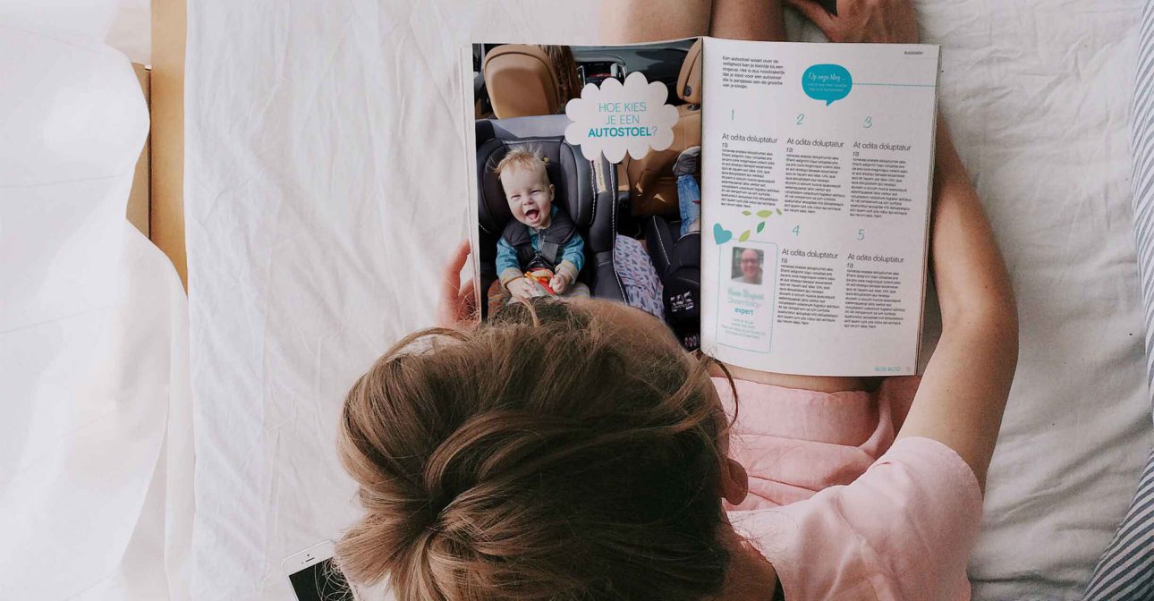
Pregnancy, giving birth, and raising young children creates demand for baby supplies. Natural requirements for anything that concerns a baby are quality and reliability, trust and comfort. For a retailer in baby supply, it is crucial not only to offer the right products, but to offer information around the subject, share relevant tips and tricks, and to make customers feel understood. Achilles Design was asked to help the brand to develop a visual identity that radiates cheerful comfort. A warm and balanced design that informs and inspires at the same time. It’s not just about selling baby products. It’s about offering (future) moms proper advice, guidance and security.
We work in close co-operation with the client, with whom we ran workshops and debriefs. We developed a dedicated communication strategy and determined the most suitable use of colour, typography and graphic elements.
We plan out an ideal scenario with several clear and fixed milestones to lead our way. With each milestone we take a step further down our creative path coming closer to the ultimate result.
Before we start designing, we went through a pre-study period, thereby running a desk research on the subject, during which we tried to better understand the customer and her needs. We then ran a gap analysis versus the current look and feel of Dreambaby and developed a new visual identity that closed the gap. The next step was to dissect the existing brand. This helped us to determine the characteristics of topics and to develop a suitable communication strategy.
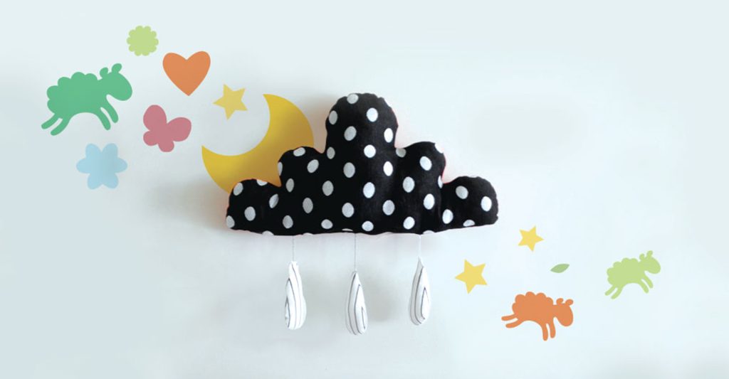
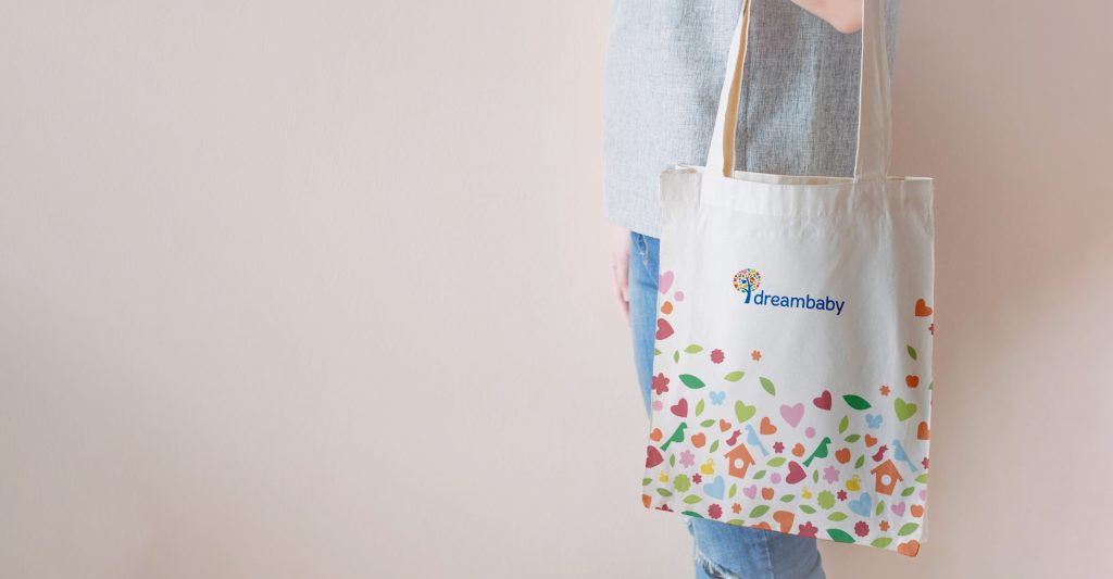
Instead of delivering a rigid corporate identity, we presented a toolkit the designers at Dreambaby can use to explore new boundaries. The tree in the logo was base for this toolkit. Next to representing new-born life and all the growth and blossoming potential it holds, the coloured leaves, which come in all shapes and sizes, can outgrow the tree and create a graphic world on their own, effectively becoming a dynamic logo. Although colours and illustration style are determined, icons can be added at will and new visual stories can be told.
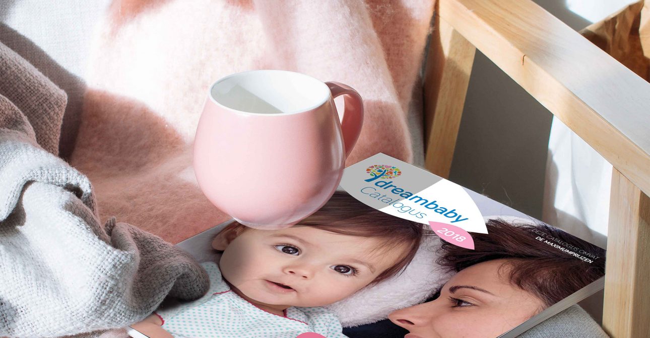
As the end customers of baby supplies are typically women, we selected softer colours and rounder shapes for the catalogue, thereby appealing more to women and demonstrating warmth and empathy rather than emphasizing a more neutral and cool quality focus. As both warm colours and round shapes are also associated with baby care, the choice of colours and shapes seemed an obvious way to upgrade the impact of the new visual identity.
Dreambaby has a more focused and relevant visual identity for parents today.
Are you ready to pioneer your product or service? Get in touch today to discuss how Achilles can help your brand stay ahead.
Be clicking send, you agree with our Privacy Policy. Learn how we use your personal data.
Be clicking send, you agree with our Privacy Policy. Learn how we use your personal data.
Be clicking send, you agree with our Privacy Policy. Learn how we use your personal data.

Be clicking send, you agree with our Privacy Policy. Learn how we use your personal data.