Brauzz
Realisation
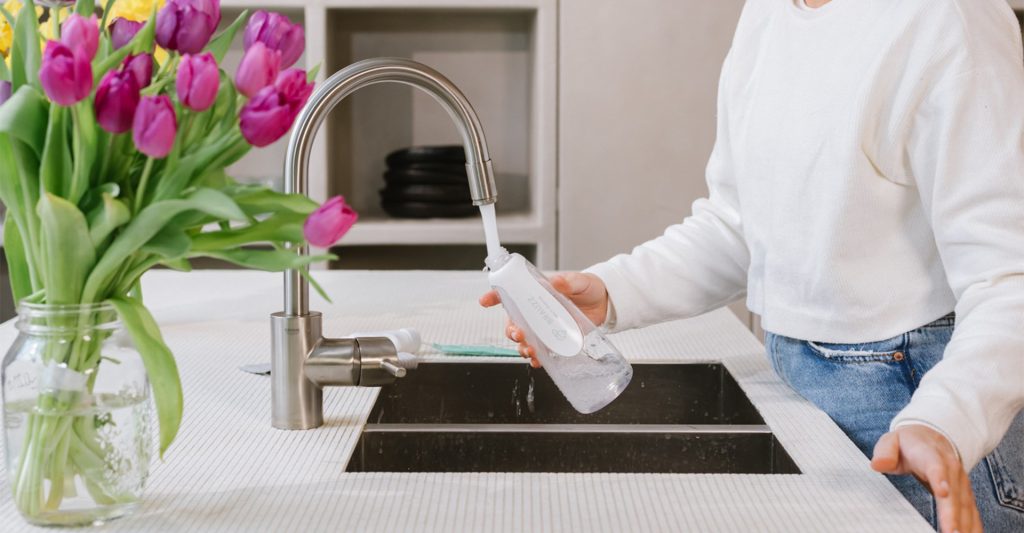
The young entrepreneurs of Brauzz. share a common passion for environment and efficiency. They came up with a solution to tackle plastic waste in the household sector. By replacing single-use cleaning product packaging with reusable bottles and refills, Brauzz. contributes to a sustainable way of cleaning.
Achilles Design was asked to create the brand identity, product and package design, reflecting their core values and beliefs.
The client already came up with the brand name. Achilles initiated a brand sprint in order turn the abstract idea of “our brand” into something more tactile and developped different impressions of what the Brauzz brand identity could look like.
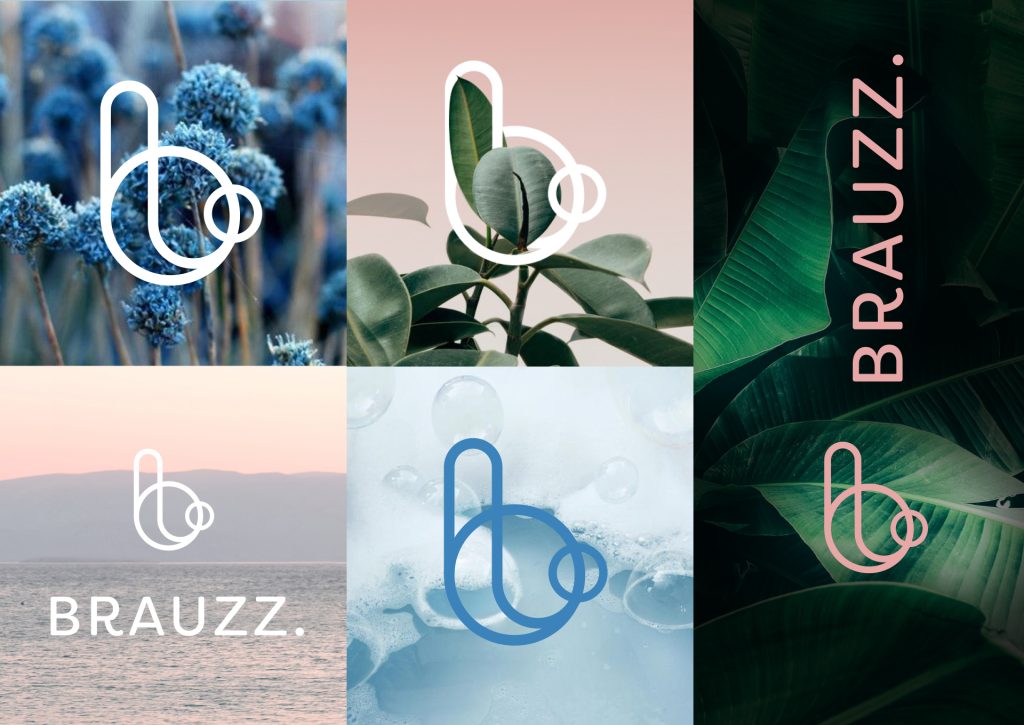
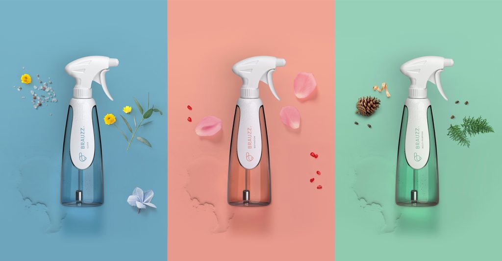
The look & feel of Brauzz. is transparent and honest, but aims to surpass the usual eco-friendly branding.
The Brauzz. logo refers to the sparkling sensation the user experiences when mixing soap powder with water. Inspired by nature, the colors reflect a positive, calm and refreshing feeling.
“The idea of conscious use of materials and graphic elements is central throughout the brand process.”
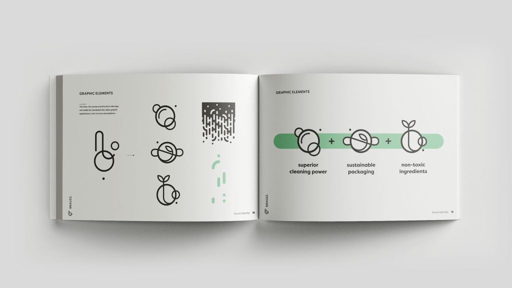
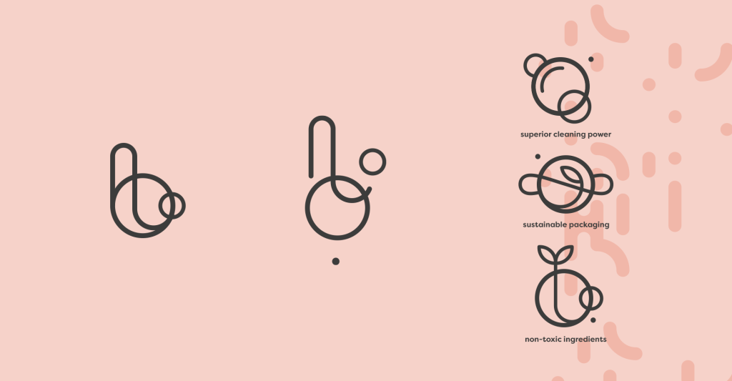
By reshuffling the elements that make up the logo, you get a playful set of clean lines, circles and dots. With this set you can endlessly create new variations of icons and patterns – recycling these elements over and over again
The photography represents the sensory experience. Stylish, serene and human. Natural lights and soft colors. A sense of freedom.

The design of the bottle is elegant and distinguishes itself from other classic spray bottles. The leaf-shaped clip not only reinforces the bottle neck but also gives the spray bottle a trendy decorative look . We explored the design and tested the ergonomics of the bottle through 3D prints.

Reflecting the brand’s identity, Brauzz. uses no-nonsense recycable cardboard packaging, enhanced with playful single-color graphics and accompanied by catchy frases encouraging the consumer.
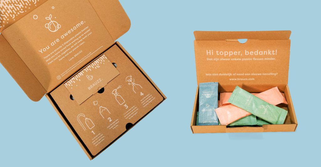
Achilles created a young and dynamic brand environment accurately expressing Brauzz.’ spirit and personality.

Are you ready to pioneer your product or service? Get in touch today to discuss how Achilles can help your brand stay ahead.
Be clicking send, you agree with our Privacy Policy. Learn how we use your personal data.
Be clicking send, you agree with our Privacy Policy. Learn how we use your personal data.
Be clicking send, you agree with our Privacy Policy. Learn how we use your personal data.

Be clicking send, you agree with our Privacy Policy. Learn how we use your personal data.