Zeeland’s Roem
Contemporary design with a playful retro twist
Realisation
- A more attractive and contemporary brand design that appeals to a younger audience
- A small booklet for additional storytelling
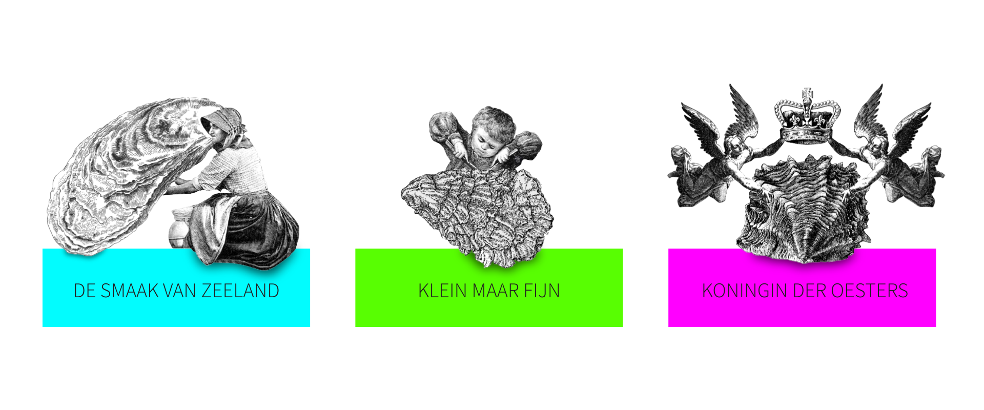
- Engraved illustrations, but with a slight twist to strip it from its ponderous nature
Create a packaging that appeals a young audience
Zeeland’s Roem is part of the Roem Group, Europe’s largest seafood processor. In a very conservative market, their Oyster packaging business somewhat lacked a strong brand recognition and a distinctive profile that would allow them to stand out against their competitors. With a more contemporary design, the company wanted to reach out to a new and younger target group. At the same time, Zeeland’s Roem wanted the new design to show the respect for the company’s long tradition in oyster farming.

Packaging
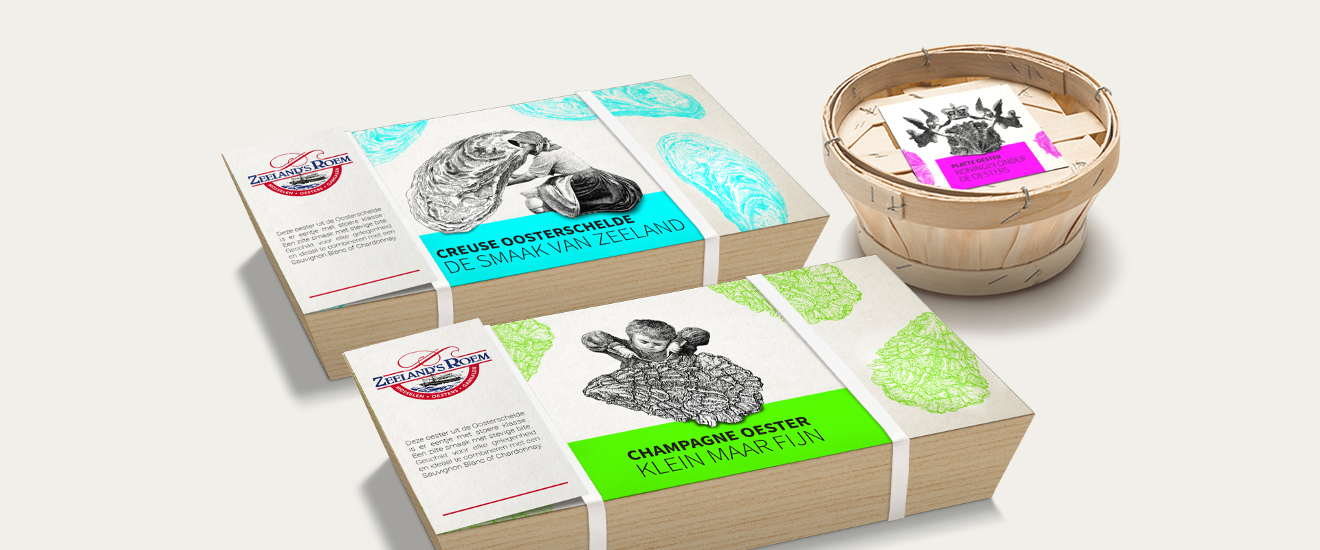
For practical reasons the actual packaging (the basket) had to be preserved. So we went for a visual makeover of the top card. Furthermore, we added a small booklet for additional storytelling.

Bright, fluorescent colors and a humorous nod to the traditional
Dutch oyster farming has a long family tradition. Furthermore, competitors often come from the same region or village. So the importance of heritage is sensitive and should not be underestimated. Unfortunately, this often leads to conservative design. The challenge was to come up with an attractive and contemporary brand, without renouncing tradition. As a reference to the long history in craftsmanship, we used engraved illustrations, but with a slight twist to strip it from its ponderous nature. The use of a simple, sans serif font and fluorescent colors gives the packaging an instant contemporary feel and makes it undeniably ‘pop’.
Let's work together
Are you ready to pioneer your product or service? Get in touch today to discuss how Achilles can help your brand stay ahead.

