Hiron
Travel light, drive smoothly and enjoy!
Realisation
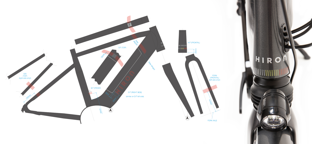
- A name, a suitable logo, graphic interpretation of the new brand, the look and guidelines for the assembly
- Development of the entire brand identity and positioning
- Modest appearance, fit for many environments, playful character but retains quality.
A new own bicycle brand
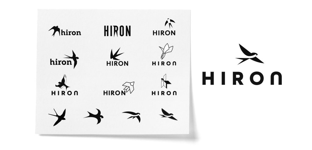
In 2020, Fiets! decided on an extension of their product range by introducing their own new bicycle brand. Achilles Design was asked to define the positioning of this new brand. On that basis, we developed a whole brand identity. We created a name, a suitable logo and the graphic interpretation of the new brand, as well as the appearance of the bicycles and guidelines for their assembly.
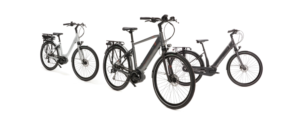
Achilles came up with the entire brand identity and positioning of Hiron. We created the branding of the bikes, in the shop window, and in the shops.
Travel light, drive smoothly and enjoy!
Everything we do starts with deep understanding and to try to get into the brand’s lifestyle. Whether you’re on your way to work or on a bike weekend with your friends, you want to be comfortable. People want a bike that can handle many rides, both a ’round trip’ to the bakery and a trip on a new biking highway (‘fietsostrade’). HIRON takes you cycling – everywhere. Hiron’s bikes carry you effortlessly on all Belgian roads. “Through wind and weather – free as a bird!”
Our first step was to dive into the world of cycling (which was not that hard because we’re all cycling enthusiasts!)
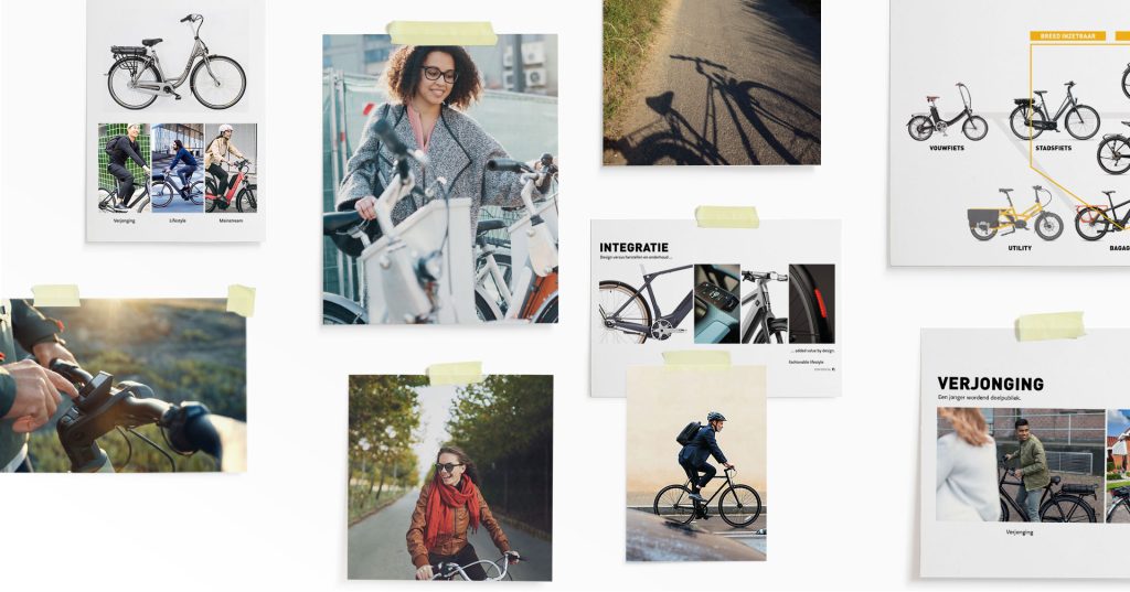
Play around with visual elements
We were able to play around with some of Hiron’s visual elements, along with the brand assets like the colors and logo. We played with the three colors, letters and photos. Cut, paste, mix – play with intuition. Ultimately, with all this background, it was much easier to exercise the visual storytelling.
Naming convention
HIRON is derived from the French word Hirondelle, or swallow. The name sounds international, but also has a Belgian character. Like the cyclist, a swallow is a migratory bird that flies through weather and wind.
Visual identity
Not coincidentally, a bird flies above HIRON. Tight and proud, he’s going to show you the way. He points to freedom you discover when cycling. And especially he always remains his sympathetic self.
The colors
The colors associated with Hiron are soft shades of red, yellow and black. Our national tricolour, but somewhat weathered. Like she’s been through a lot of sun, weather and wind. They are subtly used in communication.
Typography
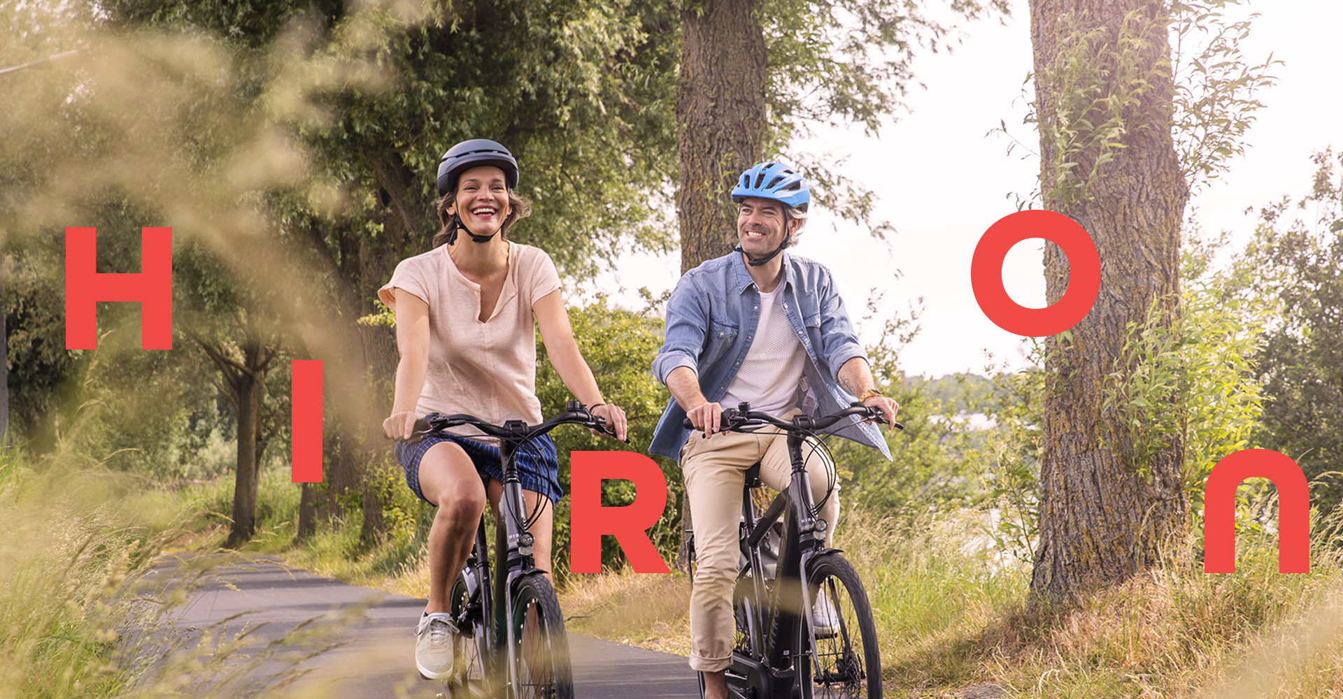
The playful freedom Hiron wants to radiate is reflected in the lettering with the letters of H I R O N. While the word (HirON) exudes reliability and the letters themselves appear rather robust and functional, they pop up ‘dancing’ in communications, to emphasize the winged freedom of the cyclist.
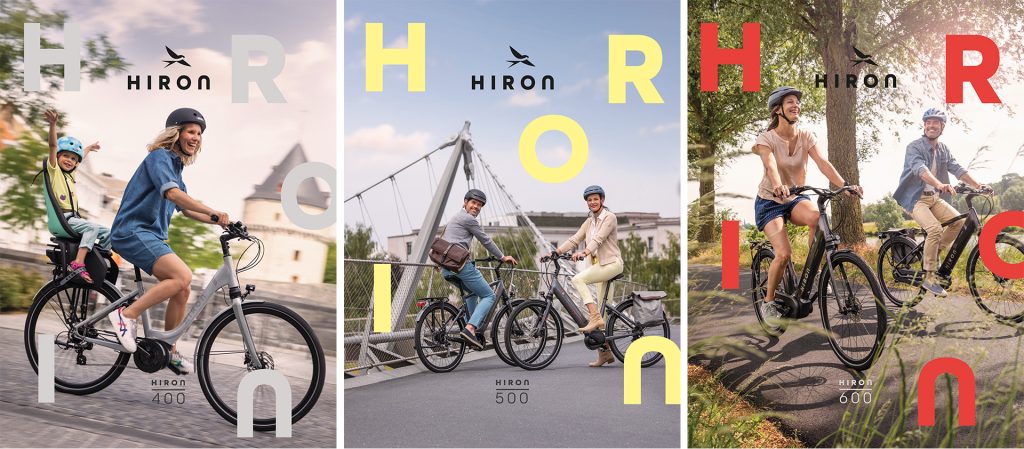
“At Hiron we want you not to ride, but to fly and feel as free as a bird.”
From a distance, the Hiron bikes have their modest appearance, fit in many environments, but retain a quality look. Closer you will discover their playful character in the fine details and colours. With Hiron we want to show that quality, accessible healing, and inclusiveness can exist in harmony.
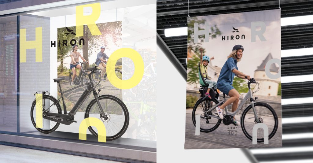
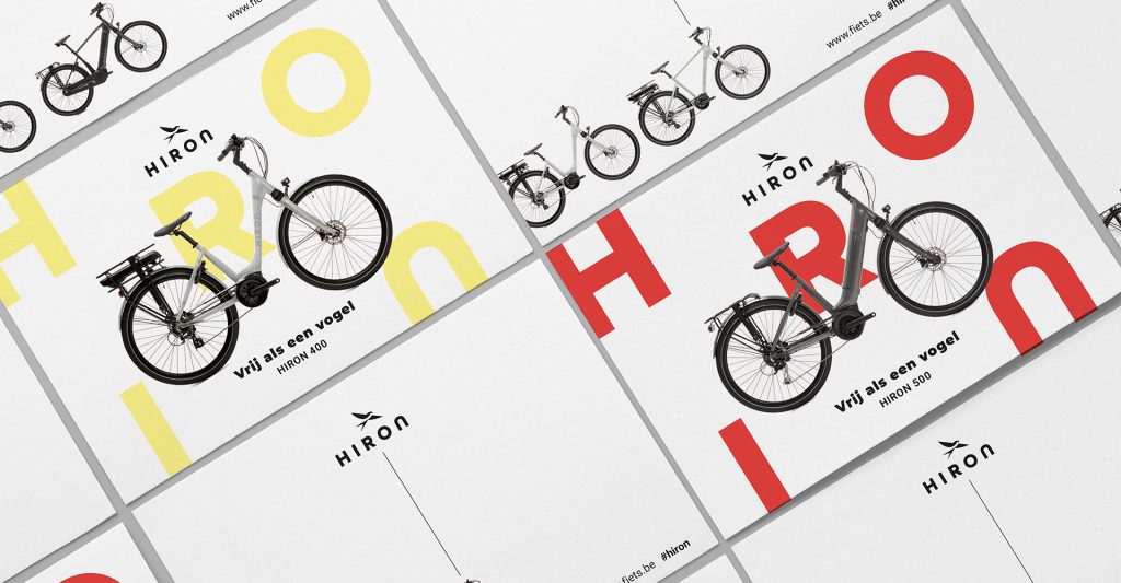
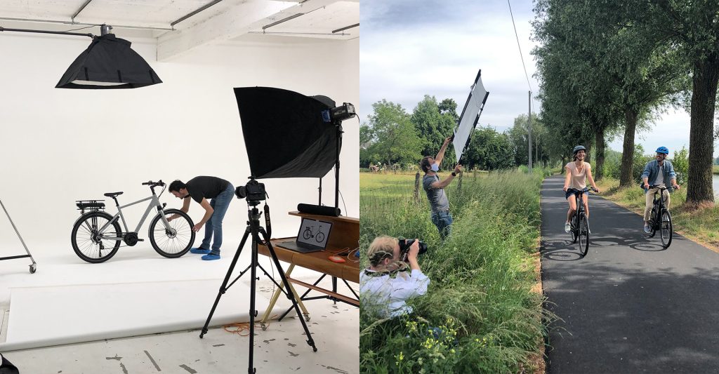
Hiron bikes are of high quality so that as a cyclist you can always enjoy every ride without any worries. Quality products and an enjoying cyclist are the two pillars of Hiron, which are always put in the spotlight. Both photography and typography exude playful freedom, while copy and font are sharp and bold. You know immediately what Hiron stands for. You see and experience that intuitively in every communication.
“Achilles was the perfect partner for the creative development of this own new brand. They thought from A to Z about the development and creation of Hiron! It was a valuable & constructive collaboration!”
Sofie Priels, Colruyt Group
Let's work together
Are you ready to pioneer your product or service? Get in touch today to discuss how Achilles can help your brand stay ahead.

