Bike Republic
A brand identity for a true compagnon de route
Realisation
- New brand strategy with a strong focus on the brand promise
- Dynamic (visual) identity that truly speaks to customers
- A design that captivates the hearts of those who are looking for distinctiveness
Bike Republic’s next strategic steps
Bike Republic (formerly known as Fiets!) is one of Belgium’s best known bicycle retail chains. The company originally targeted people who were looking for pure biking fun as well as bike repair services. Now, the company wants to move forward as a seasoned specialist who reliably accompanies cyclers on their journeys. All they have to do is enjoy their ride. We developed a new brand strategy and identity for Bike Republic in close cooperation with our client that has a strong and dynamic focus on their brand promise: to enthuse people for cycling.
‘Bike’ represents the core product of the brand. ‘Republic’ stands for togetherness and represents the community that unites the cycling experience and its related pleasure.
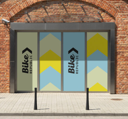
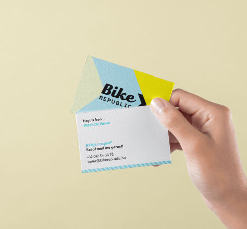
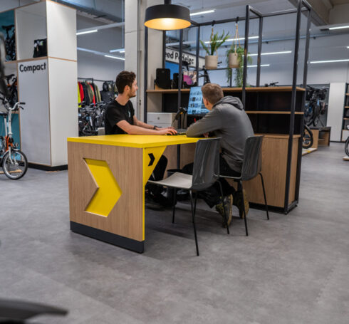
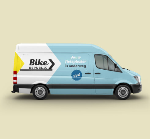

The brand promise translated in a new visual identity
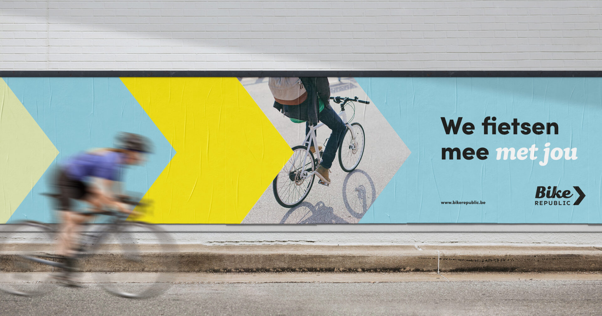
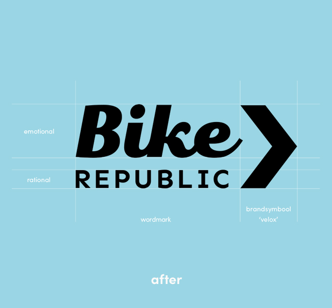
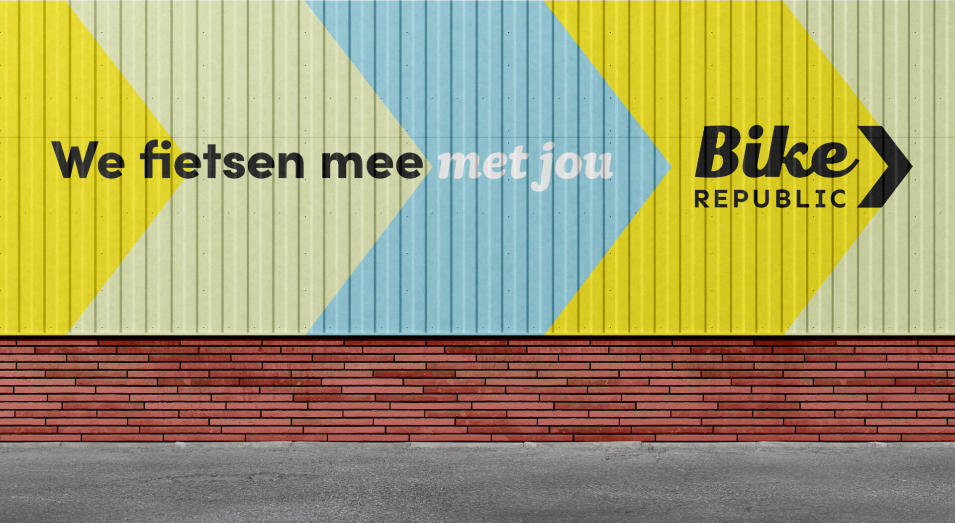
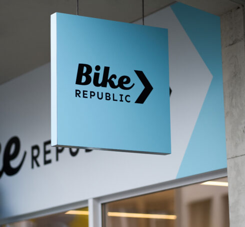
The new logo is the visual translation of the brand identity. The combination of the two fonts in the wordmark creates a harmonious mix between emotion and ratio. It gives the logo both a mature and human appearance. The brand symbol (the Velox), especially created for this identity, provides dynamism and advances communication. The name is a nod to ‘velo’, but also to speed. The Velox is the primary graphic element of our design language. It gives direction in a positive way and implies freedom of movement. Not only directional, but also in its implementation.

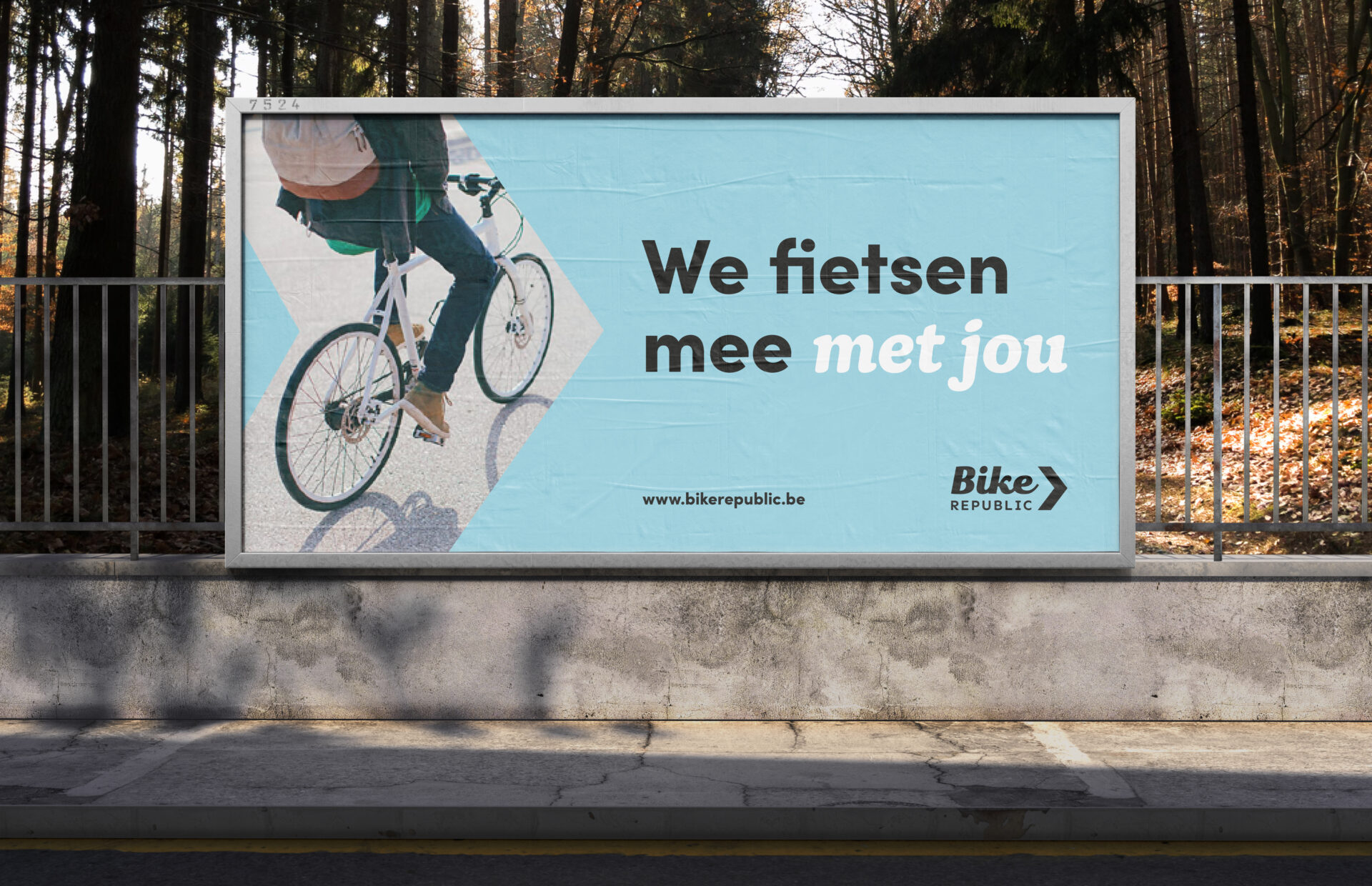

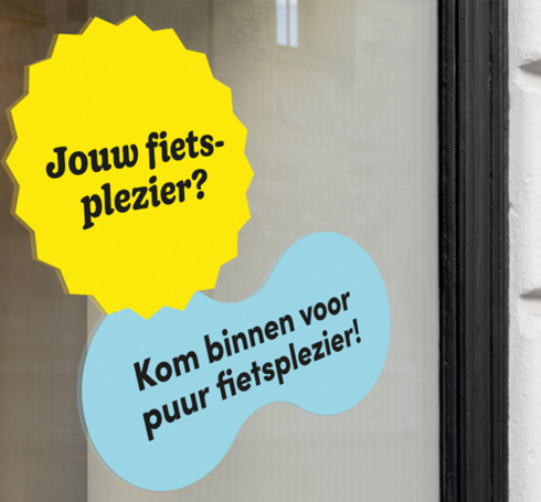
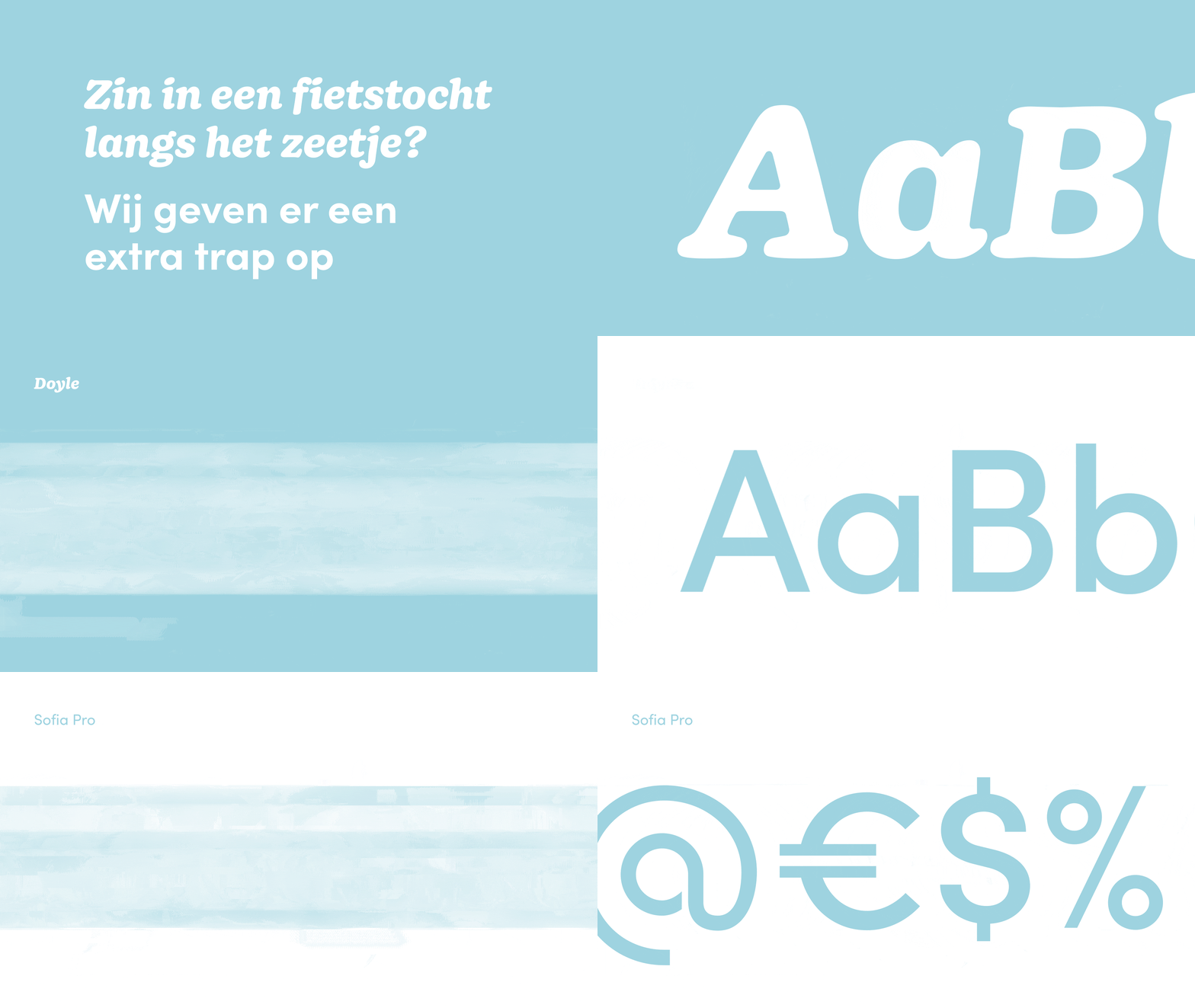
The emotional layering is reflected in the combination of the fonts. The primary font functions as the rational layer. This font type was specifically selected for its realistic and down-to-earth character, while at the same time expressing confidence. Without frills, ensuring clear communication in a mature way and most of all: without getting boring. The secondary font uses emotional layering and personal connection through its dynamic and directional appearance.

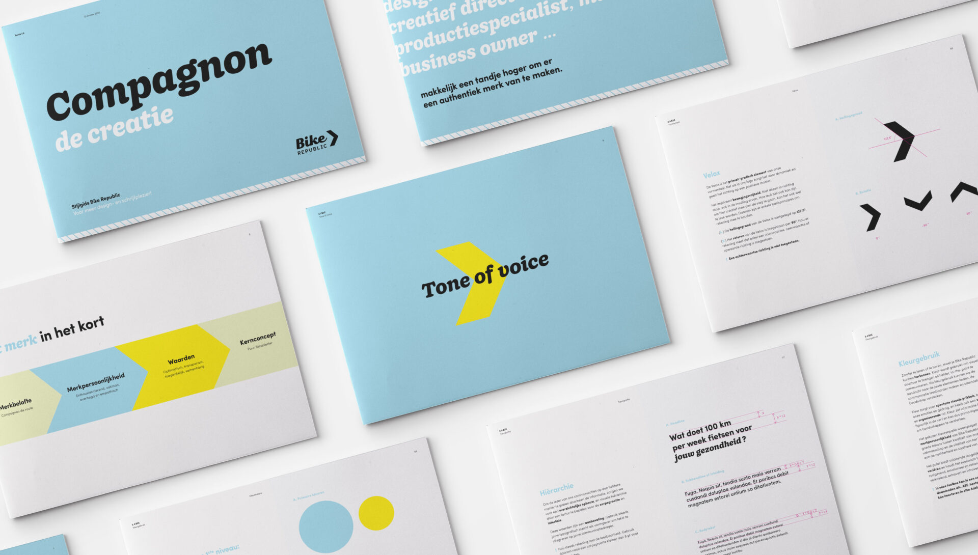
The chosen intense and energetic colour palette reflects the brand personality of Bike Republic. A good balance between quality of service and craftsmanship and the vitality of life, escaping the sobriety and dullness of daily routine. The palette offers several opportunities for variation and maintains a balance between activating and soothing, emotional and rational, warmth and coolness, extroverted and introverted.
With the main focus, creating a pleasure experience for cyclists, in mind, we developed a design that captivates the hearts of those who are looking for distinctiveness. Both emotionally and rationally. The dialogue with the customer was the guiding principle for us to come up with this design.
It was our pleasure to create a design for Bike Republic that fully reflects what their consumers are looking for today and tomorrow: a true ‘compagnon de route’.

